
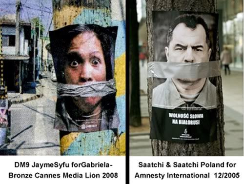
 the above ad is the award winning ad of DM9Jayme/Syfu at the 2008 Cannes Lions Awards held recently. it won the bronze award. this ad is for gabriela.
another blog, Pinoy Advertising Tsismax (link below), released the comparison, below, the ad being compared to is from saatchi & satchi poland for amnestry internations. from the comparison, it is obvious the two ads were serparated from birth. they were twins, a female and male, with exactly the same creative elements, including the electric post on a street setting and the all important creative concept of masking tape over the mouth. the last one is the strategy visual of both ads.
aslo, merle jayme is the creative in the shop ,whose name is on the name of the company. before DM9, she worked for ace saatchi & saatchi for many years.
shame! shame! or creative minds across time and space, lots of it always churn the same kind of ads? just a coincidence?
 taken from : http://advertizzzing.blogspot.com/2008/06/hhhhhhhhmmmmm.html
comments / reactions, anyone?


No comments:
Post a Comment
we encourage everyone to post a comment, their own analysis or views on any of the posts in WAWAM!
we have put all comments to be moderated to make it easy to monitor them and so that WAWAM! can respond to them.
we will not tolerate rudeness or idiocy in this blog. comments that contain personal attacks on any person or posters in this blog will be rejected.
otherwise, we will allow all other comments.